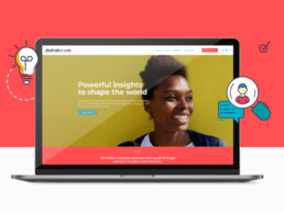
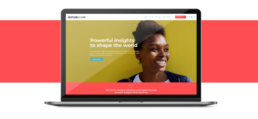
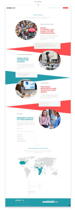
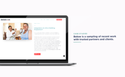
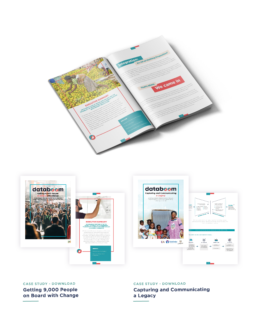
Databoom
Client sector: Social Impact / ConsultingServices: Brand Strategy - Name and Branding - Web Development
Brand Identity
Our challenge: To position a new agency as an industry leader in the field of search and communication.Our aim to create a brand that's credible and on-point, yet approachable, to stand out in its competitive landscape and become a pioneer in the development sector, carving out a unique niche
Color Palette and Font
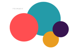
The main brand colors are black, orange and teal. Each of these hues represent elements of the databoom brand attributes and work together seamlessly. Black is sharp, on-point and knowledgeable. orange adds a dimension of warmth and being approachable while also projecting energy and fun. Finally, teal is calming and trustworthy, and helps communicate collaboration and dependability.
The main brand colors are black, orange and teal. Each of these hues represent elements of the databoom brand attributes and work together seamlessly. Black is sharp, on-point and knowledgeable. orange adds a dimension of warmth and being approachable while also projecting energy and fun. Finally, teal is calming and trustworthy, and helps communicate collaboration and dependability.
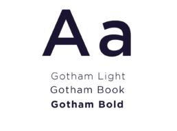
Typography
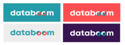
Logo Construction

The databoom logo is comprised of a custom font that is both sturdy and strong yet round and warm. It is designed to embody the brand attributes and work in a variety of settings ranging from academic to celebratory. The curves and the angles are inspired by the beauty that can be found in data. The treatment of the "o's" in the logo signify the breakthrough that occurs with a true understanding of the evidence. The dent represents the unresolved, the challenges that databoom is set to address. The mismatched circle is playful, interacting with the observer, and encouraging the imagination.
Use Logo
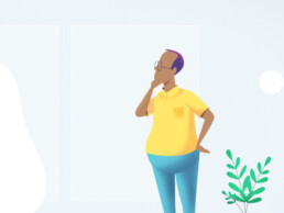
Avatars

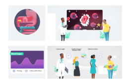
KloseCare
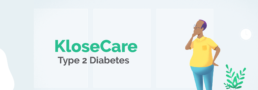
Client sector: Health Care - Adult LearningServices: Strategy, multimedia content design, illustration, animation.
KloseCare/KloseMonitoring a healthcare technology company based in TN, wanted to produce one of the best-quality and most effective educational resources about Type 2 diabetes, its symptoms, and management pillars available to patients, providers and Diabetes Educators in the US market.
The challenge
To develop a series of high-quality and user-centered audiovisual resources about Type 2 diabetes.The series supports patients, their families, in learning and retaining the essential concepts and 'strategies to cope' needed to adapt their behaviors, make significant lifestyle changes —and ultimately to manage the disease and reduce the impact of diabetes in their daily lives.
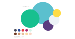
Color Palette
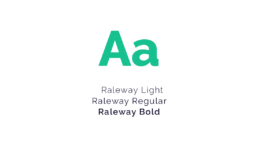
Typography
Brand system
We developed a brand system for Type 2 Diabetes series based on the principles of simplicity, empathy, accuracy, and usability.
Simplicity. The narrative is simple, relaxing, conversational, and easy to replicate.
Empathy. The series takes into account the patient’s experience, feelings, and struggles— never underestimating the psychological aspects of the disease.
Accuracy. The tone of voice is conversational, yet accurate. The narrative utilizes medical terms and doesn't shy away from introducing complex concepts/processes.
Usability. The content is practical, allowing viewers to reflect on how to implement this new knowledge in their daily routines.
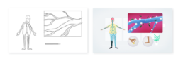
Illustration Style

Video Animation

Video Animation
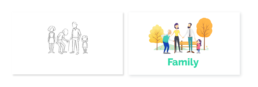
EngenderHealth

Client sector: Sexual and reproductive healthServices: Graphic and editorial design, illustration, animation
For decades, EngenderHealth has improved the lives of men, women, and families through its work in family planning, maternal health, HIV and AIDS, gender equity, and many other programs. Since 2018, Fluyt provides design and graphics support for their Communications and Marketing teams on a variety of campaigns.
Illustration Style


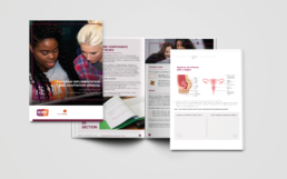
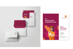
Illustration Style
Photography Style
Photography Style
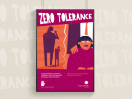
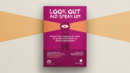
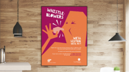
Duty of Care Campaign
(Compliance)
Duty of Care is about being responsible for your people's health, safety, and well-being. This series of posters supported a broad effort to inform and educate about safeguarding, whistleblowing, and anti-harassment in the workplace.
Way to go, EngenderHealth!
EH x Hear Me Too Campaign
Orange the World: #HearMeToo is a worldwide UN-led campaign fighting discrimination and violence against women and girls.
Reports and Manuals

Applications

Video Animation
Campaign to thank you donors and supporters
(2D animation)
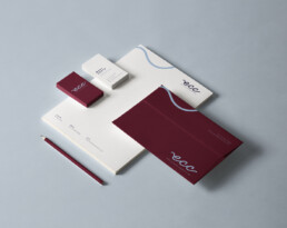
Eau Claire Consulting

Client sector: Social Impact / ConsultingServices: Strategy, branding, website, copywriting.
Brand Identity
Eau Claire—French for ‘clear waters’—symbolizes transparency, clarity, consensus and flow - an ideal image for the way Mary Kante partners with clients to bring clarity and achieve impact. It has a direct connection to her hometown and Midwestern farming roots - a unique quality she brings to each client interaction.
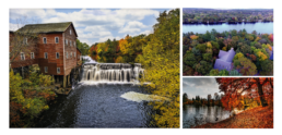
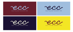
Color Palette Inspiration
Color Palette and Font
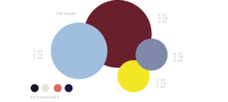
Barn Burgundy: Inspired by the reds found in the Wisconsin landscape, this color allows for high contrast. It can be associated with leadership,
sophistication, and strength.
Water Blue: This color represents the water and its transparency. Blue is associated with clear thinking, decisionmaking, trust, and open lines of communication.
Fog Purple: A timeliness and classic color that represents calm and elegance.
Sunshine Yellow: This color is inspired by nature but embellished a bit to be bold and design-oriented. It is associated with high energy, positivity, and hope.
Barn Burgundy: Inspired by the reds found in the Wisconsin landscape, this color allows for high contrast. It can be associated with leadership, sophistication, and strength.
Water Blue: This color represents the water and its transparency. Blue is associated with clear thinking, decisionmaking, trust, and open lines of communication.
Fog Purple: A timeliness and classic color that represents calm and elegance.
Sunshine Yellow: This color is inspired by nature but embellished a bit to be bold and design-oriented. It is associated with high energy, positivity, and hope.
Typography

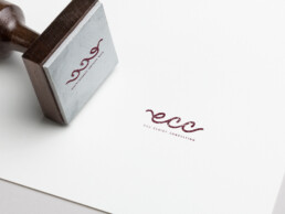
Logo Construction
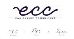
The logo consists of a single curve connecting the initials in Eau Claire Consulting, ECC. A single curve is purposeful yet gentle - it depicts the importance of a clear path and flow.
The concept behind the logo draws inspiration from waves in natural waters, but not in a predictable way. Its negative space creates a graceful visual illusion.
Finally, the curved shape resembles a personal signature, suitable for a consulting business, reinforcing the quality of Mary’s work.
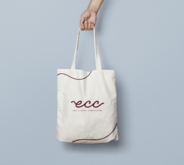
Use of Logo
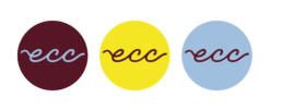
Avatars
Applications