Client sector: Social Impact / ConsultingServices: Brand Strategy - Name and Branding - Web Development
Brand Identity
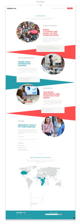
Our challenge: To position a new agency as an industry leader in the field of search and communication.Our aim to create a brand that's credible and on-point, yet approachable, to stand out in its competitive landscape and become a pioneer in the development sector, carving out a unique niche
Color Palette and Font

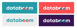
The main brand colors are black, orange and teal. Each of these hues represent elements of the databoom brand attributes and work together seamlessly. Black is sharp, on-point and knowledgeable. orange adds a dimension of warmth and being approachable while also projecting energy and fun. Finally, teal is calming and trustworthy, and helps communicate collaboration and dependability.
The main brand colors are black, orange and teal. Each of these hues represent elements of the databoom brand attributes and work together seamlessly. Black is sharp, on-point and knowledgeable. orange adds a dimension of warmth and being approachable while also projecting energy and fun. Finally, teal is calming and trustworthy, and helps communicate collaboration and dependability.
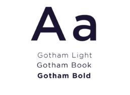
Typography
Logo Construction

The databoom logo is comprised of a custom font that is both sturdy and strong yet round and warm. It is designed to embody the brand attributes and work in a variety of settings ranging from academic to celebratory. The curves and the angles are inspired by the beauty that can be found in data. The treatment of the "o's" in the logo signify the breakthrough that occurs with a true understanding of the evidence. The dent represents the unresolved, the challenges that databoom is set to address. The mismatched circle is playful, interacting with the observer, and encouraging the imagination.
Use Logo
Avatars