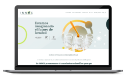
Client sector: Healthcare / InnovationServices: Strategy, branding, web design, and illustration A modern, people-centered and quality assured healthcare system is supported by innovations and global scientific production. INNOS is a multi-stakeholder platform that works collaboratively to make scientific knowledge more accessible to the key players of the healthcare system. Better information and insights translate into better decision-making for the benefit all Colombians. INNOS was launched in 2020 by the Association of Pharmaceutical Research and Development Laboratories (AFIDRO), in partnership with El Bosque University, and the IEX innovation hub.
Name, branding and website were developed by FLUYT. www.innos.co
The Challenge
To create a highly energetic and engaging, yet professional brand, to summon experts, practitioners, patients, researchers and doctors around honest and evidence-based conversations on the fundamental issues affecting innovation in the health sector.
Brand Identity
Color Palette
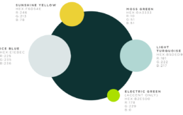
Barn Burgundy: Inspired by the reds found in the Wisconsin landscape, this color allows for high contrast. It can be associated with leadership, sophistication, and strength. Water Blue: This color represents the water and its transparency. Blue is associated with clear thinking, Water Blue: This color represents the water and its transparency. Blue is associated with clear thinking, decisionmaking, trust, and open lines of communication.decisionmaking, trust, and open lines of communication.
Barn Burgundy: Inspired by the reds found in the Wisconsin landscape, this color allows for high contrast. It can be associated with leadership, sophistication, and strength. Water Blue: This color represents the water and its transparency. Blue is associated with clear thinking, Water Blue: This color represents the water and its transparency. Blue is associated with clear thinking, decisionmaking, trust, and open lines of communication.decisionmaking, trust, and open lines of communication.
Color Palette
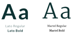
Typography
Logo Construction
The INNOS logo is inspired by the idea of making science accessible. The logo lockup is comprised of the logotype, replacing the letter O with the shape of an atom, accompanied by the full name of the Institute at the base of the composition. The logo is straightforward and dynamic, reflecting the values and mission of the Institute. The atom shape is simple and versatile. This shape is central to the brand system. It can be used on its own, as a cropping mask for images, or for embellishments and illustration.
Use of Logo
Use of Logo
Avatars
Avatars
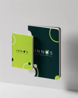
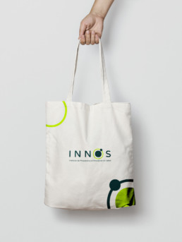
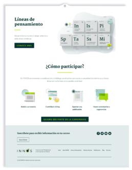
Applications